鬼王候選人
「要喺地獄成為鬼王,或佔一席位,競爭真係好大!強如我 —— 新拾蚊紙,自二零零二年七月面世以來,不停被各方強者挑戰,真係身心疲憊。趁今晚『哈囉喂』,幾唔得閒都要出嚟宣傳一下自己!」
「可能較後生嘅觀眾見慣咗九彩嘅銀紙世界,唔覺得我有幾強。但我要話俾大家知,先河係由我創嘅!唔好睇小我嘅來頭呢!就此,我專程坐時光機返到二零零二年十月,搵咗康港設計之父石漢瑞先生嚟為我拉票!」(呢度嗰幾條騎呢騷寫手,冇嚟聲望,邊夠班同牙力㗎!?)
「地獄設計地獄到一個地埗可以引來罪犯垂青,做到 forger-friendly,你話嘞,夠邪惡啦啩?!」
「可能較後生嘅觀眾見慣咗九彩嘅銀紙世界,唔覺得我有幾強。但我要話俾大家知,先河係由我創嘅!唔好睇小我嘅來頭呢!就此,我專程坐時光機返到二零零二年十月,搵咗康港設計之父石漢瑞先生嚟為我拉票!」(呢度嗰幾條騎呢騷寫手,冇嚟聲望,邊夠班同牙力㗎!?)
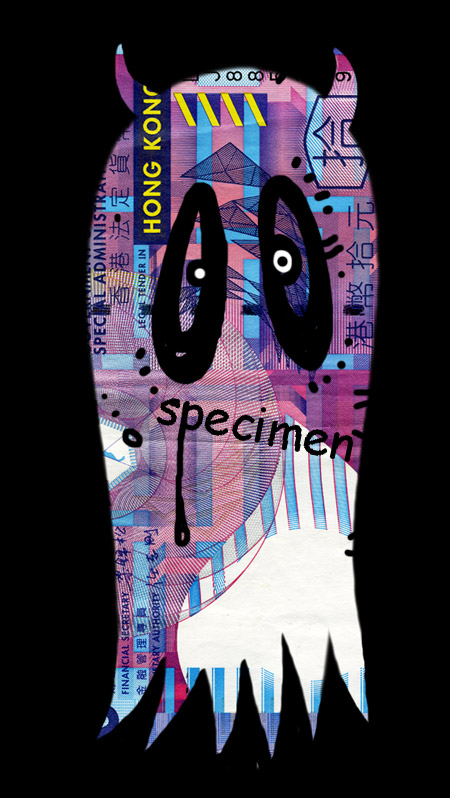
《Garish design of new HK bank note makes life easier for forgers》— Media, 18 October 2002
I once stayed at a hotel in mid-Manhattan named Elysée. It had been awarded the sobriquet 'Easy Lay' by past guests, among them Tennessee Williams.
Perhaps he preceded me in a room with particularly garish wallpaper that might have accelerated his demise. Such tastelessness helped send off an earlier playwright. More of that later.
Our new HK$10 bank notes boast patterns and colours similar to those which the Elyée’s room burned into my retina. Their coupon-like vulgarity has already been widely disparaged; they stand apart from the existing currency like a bruised thumb.
Aesthetics are helpful in paper currency, but there are more serious issues: security and symbolism.
Among the few features to prevent counterfeiting accessible to the ordinary user is the hexagonal see-through which shows a horse when hold to the light. Its registration allows for considerable printing tolerance (aka forger friendliness) due to the spokes that overlap the various bits of the animal.
While the watermark of a Bauhinia blossom is a classic security device, the intaglio or raised printing will not be of universal value; many Hong Kong people handing bank notes wear gloves, especially in the wet markets.
Generally, the gaudy colouring and manic patterns will allow criminals to take advantage of the fact that subtlety is harder to reproduce that its opposite.
Other than a largish Chinese character for 10, on both sides, which – rather than reflecting the highest standards of calligraphy – appears to have been drawn by a Dutchman, what is of greater concern to me as a branding specialist are the absent or ambiguous references to our city.
Why a see-through horse? At first glance it reminds one of Lloyds Bank’s prancing black stallion, adding to the ambiguity. One is hardly reassured that the current zodiac animal in the lunar calendar is its reference, not the Jockey Club. Does this mean we shall have a see-through goat come next year?
Beyond these we can discern no images relating to Hong Kong, no scenes, no symbols – not even a junk. Icons reassure both residents and visitors. Currency, along with a flag and an airline or two, is a declaration of identity and a statement of aspiration. How much easier to wallpaper these new notes rather than take a visual stand reflective of Hong Kong. The lesson to bureaucrats: please don’t design.
One the new note there is a white shape around the watermark which looks suspiciously like a light bulb. Perhaps it symbolises the bright ideas of civil servants, smoothly delivered on time and within budget.
Back to the deathbed of Oscar Wilde in a shabby Left Bank hotel named L’Alsace – sobriquet unknown. Looking around the room, he said, effectively, “Either that wallpaper goes or I do.”
— Henry Steiner is the founder of Steiner & Co.
「地獄設計地獄到一個地埗可以引來罪犯垂青,做到 forger-friendly,你話嘞,夠邪惡啦啩?!」
posted by 學子 at 23:15
3 comments
![]()