用 Comic Sans 其實同用其他字款一樣,都唔係乜嘢彌天大罪。字款同顏色一樣,佢哋本身冇對與錯之分。問題出於用者背後嘅動機 (理由)。據說,Comic Sans 類似的手寫型字款,是十分之「Dyslexia Friendly」的呢。不過我打死唔信大部份 Comic Sans / 少女體用家有如斯高見!
I didn't realise "Comic Sans Serif" is called "Young Girl Type" in Chinese! That's rather apt!
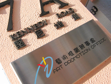
My first impression when I saw the sign was "Oh, how cute!" and then immediately "How nice!" It IS nice to have something slightly irreverent in official signage for what usually are very stuffy government offices. For an "Art Promotion Office" the cutie typography does impart a sense of "we don't take ourselves too seriously here", which, given the remit of the office, is quite a nice message to project across. I like its happy-go-lucky feel, and made me think that this office isn't just about promoting serious dead-pan art.
Of course, the above is said by someone who absolutely adores the website CuteOverload! Go cute!
Personally, they probably had the idea about "not so seriously" like you guys said. But good design needs to be serious, too. The "non-seriousness" in their case is not the same as "open-minded, casual, optimistic attitude on design" (I hope this is the closest to what that is)
But...can they please use ANOTHER cute font rather than comic sans???

9 Comments:
我最近才發現原來康民處個logo,英文隻logo type原來是"comics",好cutie囉
嘩!真係要單聲俾康民處聽,有個國際反 Comic Sans 組織做緊嘢喎!
(不過都幾開心,我哋嘅政府部門,有咁多都咁 cutie!感覺好和藹可親,又有蕉氣!)
我中六中七教Chem的老師用comic sans編寫她所有的筆記. 大家點睇?
你老師為人一定非常cute~陳慧嫻跳舞街果隻
用 Comic Sans 其實同用其他字款一樣,都唔係乜嘢彌天大罪。字款同顏色一樣,佢哋本身冇對與錯之分。問題出於用者背後嘅動機 (理由)。據說,Comic Sans 類似的手寫型字款,是十分之「Dyslexia Friendly」的呢。不過我打死唔信大部份 Comic Sans / 少女體用家有如斯高見!
依家政府d CI比埋d九流流既公司做,梗係成舊屎啦~
比JOB出去recurit公司果位人兄重大責任過做果位呀~根本成條食物鏈都出左事..... 貓~~~
I didn't realise "Comic Sans Serif" is called "Young Girl Type" in Chinese! That's rather apt!
My first impression when I saw the sign was "Oh, how cute!" and then immediately "How nice!" It IS nice to have something slightly irreverent in official signage for what usually are very stuffy government offices. For an "Art Promotion Office" the cutie typography does impart a sense of "we don't take ourselves too seriously here", which, given the remit of the office, is quite a nice message to project across. I like its happy-go-lucky feel, and made me think that this office isn't just about promoting serious dead-pan art.
Of course, the above is said by someone who absolutely adores the website CuteOverload! Go cute!
呢個 caption 使我發笑!
Personally, they probably had the idea about "not so seriously" like you guys said. But good design needs to be serious, too. The "non-seriousness" in their case is not the same as "open-minded, casual, optimistic attitude on design" (I hope this is the closest to what that is)
But...can they please use ANOTHER cute font rather than comic sans???
Post a Comment
<< Home