Have anyone saved an actual image of the old logo so that we could compare the two together? I left HK (yes, abbreivated, but this is only a humble note not a logo) ages ago and I can't quite remember what the old one looks like....
And are you telling me that Standard and Chartered is getting rid of their "plaited" logo???? I LOVE that logo! It'd be such a shame...

9 Comments:
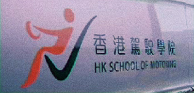
舊底嗰個三角嘜有乜問題,要無啦啦玩「食環署式」藍橙 free-form 不倫不類?!英文名稱先怪,Hong Kong School of Motoring 就 Hong Kong School of Motoring 啦,全名就全名,簡稱就簡稱,H 乜鬼 K 啫!唔係為咗想監粗中英文齊頭尾嘛!?
本來唔覺原本三角嘜有乜好,相比之下,高低立見。(趁佢個 website 仲未轉新形象,拿拿臨去悼念一下三角嘜啦老友!www.hksm.com.hk)
... ... ... ... ... ...
撈稿個人仔,我估,應該揸緊車去大快活 meet friend。
咪係囉,尤其三角嘜個形同隻色,就算唔突破都知個concept來自道路標誌,雖然老土但起碼明明白白。
其實以前果乍硬錚派logo(eg: 大快活,香港電訊,UPS, 駕駛學院, PizzaHut, burgur king, 渣打錢莊...)已經開始慢慢被淘汰,家下個個要"Dynamic", 要郁要動感,樣樣嘢都攪到卡通哂,悲~!!!
Dynamic 可以,但唔該 dy 得好少少,有美感少少,嚴謹少少,高格調少少,有理由少少,襟用少少 ... ... 真該唔該!!!
唔知是否受到書法的影響
中港的標誌都愛有機毛筆Dynamic
尤其大陸
例牌要用"中國元素表現我國深厚的文化底蘊"
毛筆 Dynamic 可以,但真係唔該搵支真毛筆,搵張真紙攪,咪貪方便齋用電腦,假到無倫!(不過,假,可能至係我國近代深厚文化底蘊所在呢 ~~~ )
我覺得似有個人比支大鐵筆刮正某些部位咯...
Have anyone saved an actual image of the old logo so that we could compare the two together? I left HK (yes, abbreivated, but this is only a humble note not a logo) ages ago and I can't quite remember what the old one looks like....
And are you telling me that Standard and Chartered is getting rid of their "plaited" logo???? I LOVE that logo! It'd be such a shame...
http://www.hksm.com.hk/title/logo.gif
此乃舊撈稿也!(佢哋好似仲未捨得換新嗰個,都算有啲 sense 啦!)
Post a Comment
<< Home